

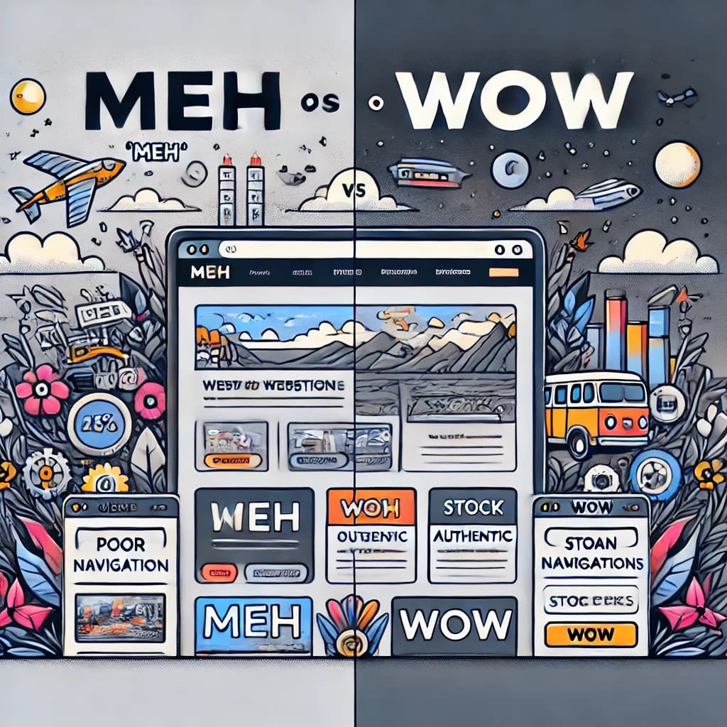
Break from meh to wow with 13 website tips
Break from meh to wow with 13 tips. 13 Hilariously Relatable Ways to Make Your Website Better (with Goofy Examples)
Creating a great website doesn’t have to be as dry as toast. Let’s dive into these common website improvement tips with a touch of humor and some ridiculous examples to keep things light!
1. Clear Headings
Avoid Confusion Over What Your Website Does
Imagine landing on a site with the heading:
“Stuff That’s Cool.”
What does it do? Sell jetpacks? Write movie reviews? Offer ice cube recipes?
Instead, be clear. If you’re running a bakery, try:
“Delicious Artisan Bread and Cakes Delivered Fresh to Your Doorstep.”
Visitors should know immediately if they’ve found the promised land of carbs.
2. Subheadings
Guide Your Reader, Don’t Leave Them Lost
Subheadings are like those signs at Ikea—without them, you’re wandering aimlessly.
Example of a bad subheading:
“Other Things”
Helpful, right?
Instead, use:
“Our Popular Products,” “How It Works,” or “Why Choose Us?”
These lead visitors like a GPS: “Turn here for the good stuff.”
3. Intuitive Navigation
Keep It Simple, Sherlock
Bad Navigation:
- “Click Here for Wonders”
- “Mystery Portal”
- “We’re Not Telling You Where This Goes.”
Good Navigation:
Stick to basics like:
Home | About Us | Products | Blog | Contact
It’s not a scavenger hunt. Let’s save the intrigue for murder mysteries.
4. Skip the Slides
Your Carousel Isn’t Disneyland
Carousels (aka sliders) seem fun until you’re clicking desperately to find the information you need, like:
“Where’s that ‘Contact Us’ button? Slide 5? Slide 8?”
Static images with one clear call-to-action work better.
Bad Example:
- “Slide to learn more!” (Meanwhile, everyone slides away from your site.)
Good Example: - “Start Your Journey Today—Sign Up Now.”
5. Avoid Stock Photos
No More Overly Happy People in Suits
The world doesn’t need another stock photo of people high-fiving in an office.
Bad Example:
![Stock Photo Description: Five people pretending to laugh at a blank computer screen.]
Good Example:
Use actual photos of your team, office, or products. Show your adorable office dog if you have one. Dogs are irresistible.
6. Social Media Buttons
Don’t Let Them Steal the Show
Bad Example:
A blinking neon bar of social media icons above the headline, screaming,
“Follow Us! FOLLOW US NOW!”
Good Example:
Put them in the footer or at the end of a blog post.
“Enjoyed this post? Follow us for more.”
Let them read your content first before you throw a Twitter handle at them.
7. Say Goodbye to Dates on Evergreen Content
If your article on “Top Travel Destinations” is dated 2018, readers might assume you’re still recommending trips to Narnia.
Bad Example:
“Last updated: February 2, 2017”
Good Example:
Just remove the date entirely unless the content is time-sensitive (e.g., “Breaking News: Narnia Now Accepting Visitors”).
8. Break Up Long Paragraphs
Attention Spans Are Tiny
Bad Example:
Here’s a giant wall of text about our services that will overwhelm you so much you close the tab.
Good Example:
Use short, snappy sentences. Throw in bullet points.
Like this one:
- Easy to read.
- Fun to scan.
- No headaches involved.
9. Press Releases? Leave That to the PR People
Bad Example:
Your website has a “Press Releases” tab filled with jargon like:
“We’re pleased to announce a strategic partnership to leverage our synergies in a dynamic marketplace.”
Nobody wants to read that.
Good Example:
10. Say No to PDFs Unless You Hate Convenience
Focus on blogging or case studies. Let someone else handle the corporate mumbo-jumbo.
Imagine clicking on a “Menu” link at a restaurant site, and instead of a sleek page, you get a downloadable PDF named “Menu_final_FINAL_(use_this).pdf.”
Just don’t. Use an HTML page instead. It’s easier for everyone.
11. Testimonials
Keep It Real
Bad Example:
“This product changed my life!!! – Anonymous”
Was that a robot? A ghost? We’ll never know.
Good Example:
“The best vacuum cleaner I’ve ever used—picked up all my dog’s fur in minutes! – Sarah J., New York.”
Use real names, photos (if possible), and relatable examples.
12. Contact Pages
Skip the Email Links
Bad Example:
“Want to reach us? Email us at we-don’t-******@*********ot.com.”
Good Example:
A proper contact form with fields like: Name, Email, Message, and maybe a dropdown for inquiries like “Support,” “Sales,” or “Just Saying Hi.”
13. Avoid Useless Pages Like “Bye bye”
Bad Example:
“Thanks for your inquiry! Now stare at this lonely page until you hit the back button.”
Good Example:
Once someone completes a form, show a quick inline message:
“Thanks! We’ll be in touch shortly. Here are some of our top resources while you wait!”
This keeps them engaged instead of kicking them to the curb.
Bonus Tips for the Overachievers
- Loading Speed: Don’t make users wait longer than it takes to brew coffee.
- Mobile First: Test everything on a phone—if it’s hard to navigate, fix it!
- SEO: Sprinkle some keywords around, but don’t stuff them like a turkey.
Making your website better doesn’t have to be boring. Follow these tips, and your site will go from “meh” to “wow”faster than you can say “stock photo.” Just remember: clarity, simplicity, and a touch of authenticity always win the day!
Shop tip
Are you eager to learn how to set up your online business? Join in signing up.
If you want to learn how I built ‘Barelon’ and started earning online? Join me as your mentor at Wealthy Affiliate to discover affiliate marketing, web building, and more! And I’ll be happy to assist you through!